Site being compared
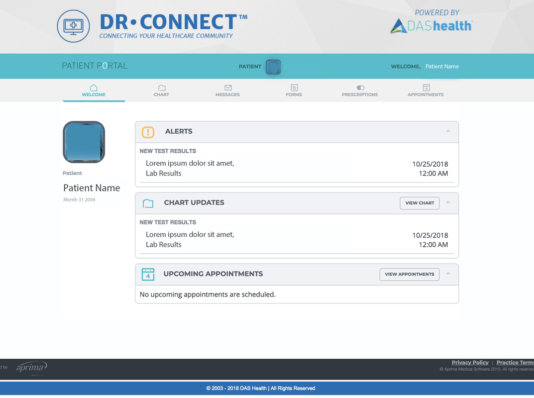
Another site I chose was Patient Portal, the platform for checking medical records and creating appointments for patients of Women's Health Practice.
Analysis
Landing page:
1. How does the usability of this competitor compare to the application you are trying to fix?
What do they do better, what do they do worse?
2. Can you see some design tradeoffs in the different choices that different designers have made?
What do they do better, what do they do worse?
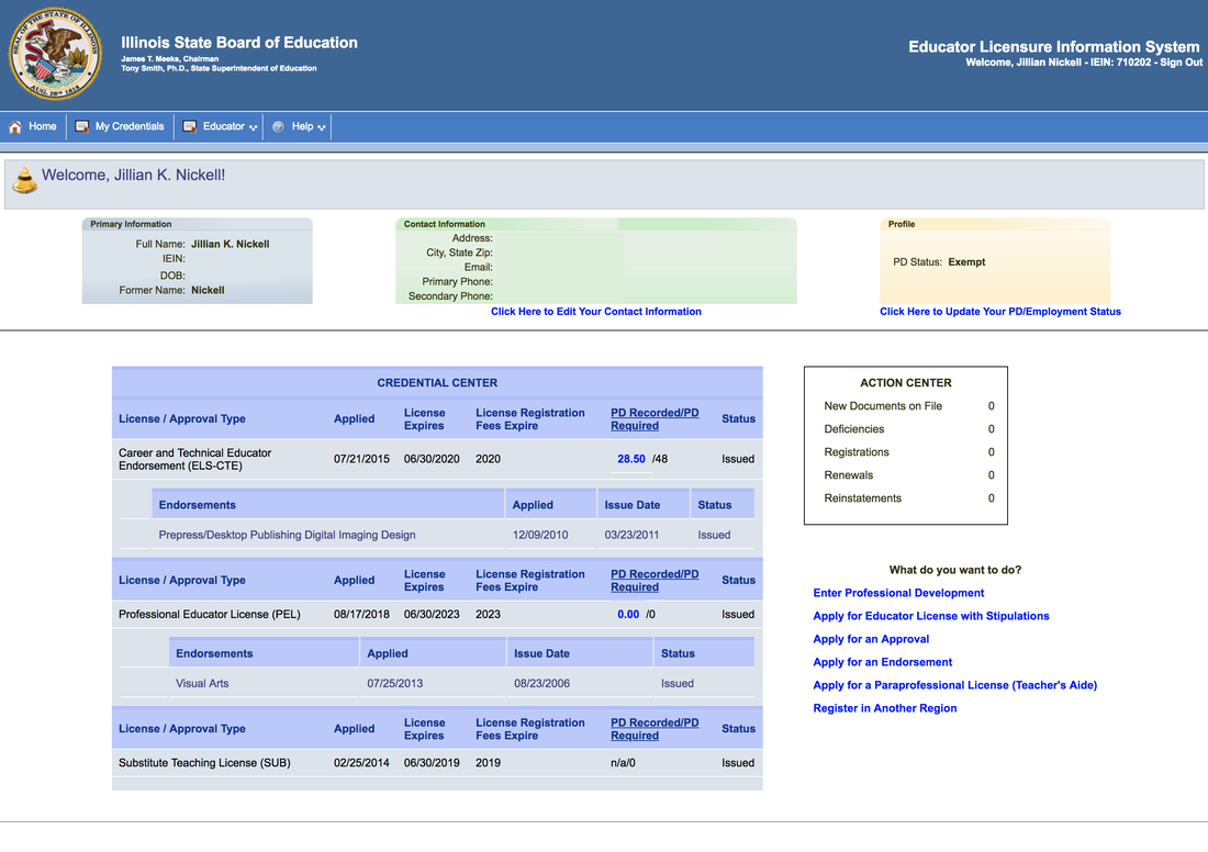
- Dr Connect is overall cleaner and has more clearly defined hierarchy, and better use of design principles. Alerts, chart updates, and upcoming appointments are large and more noticeable, with subcategories up top taking a back seat. Even the banner and logo are much more noticeable. Again, ELIS is compressed and everything is visually similar size and weight, very little hierarchy. Most of it is the same color too. The table especially is confusing and could take design inspiration from Dr. Connect.
2. Can you see some design tradeoffs in the different choices that different designers have made?
- Truthfully, the ELIS site just seems a lot more dated and like they did no usability testing whatsoever. It's challenging to navigate and find the correct information on the landing page.
Making an appointment/Adding Experience:
1. How does the usability of this competitor compare to the application you are trying to fix?
What do they do better, what do they do worse?
What do they do better, what do they do worse?
- While not 100% analagous, the landing page for managing appointments and the landing page for adding experience do have some commonalities. Again, the design on mycarle includes more whitespace/better hierarchy overall (carried over from the main site). I also feel that the boxes on MyCarle flow better and are easier to read than the table on ELIS. It's a lot clearer where to click to add experience/ add an appointment. Information is chunked more evenly together with a very clear hierarchy on MyCarle (schedule an appointment with a provider you've seen, or tell us why you're coming in). ELIS, it's all small fonts and it all mushes together, and it's not as clear immediately where to click for what you want.
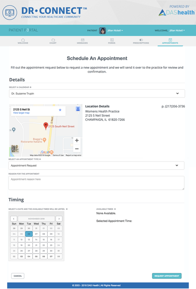
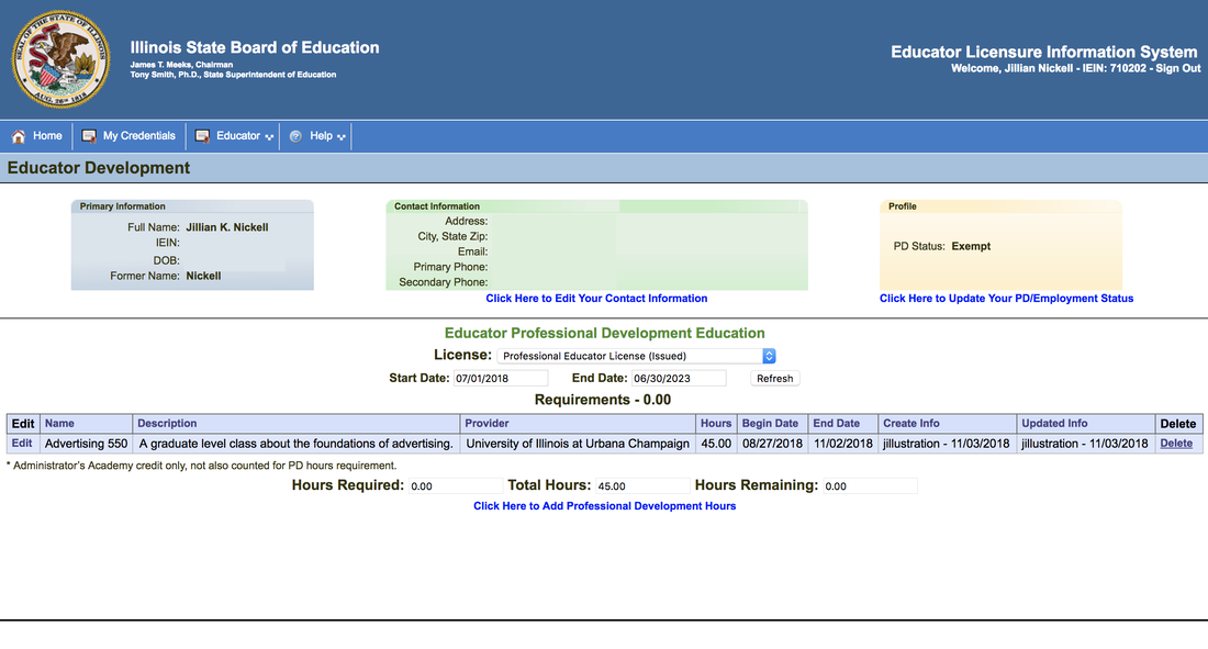
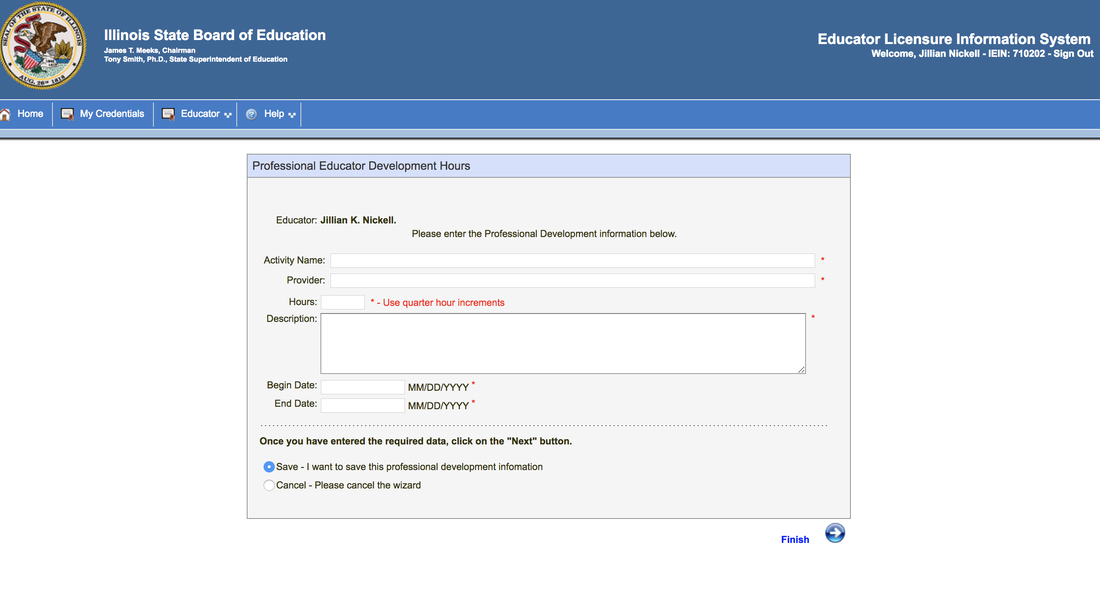
- The hierarchy of appointment scheduling on Dr. Connect and ELIS' professional development time entry are actually pretty similar/not great visually. Both could benefit from a lot of hierarchy/design principles.
- I really think the designers of ELIS probably didn't do usability testing and instead just made a site that was easy for developers to make and not for users to use. It smacks of a Microsoft Office excel sheet. It likely is an older interface, but almost no design or hierarchy was taken into consideration even so. I also think Dr. Connect is a step above ELIS but could also benefit from a lot more user testing to make it more readable and less confusing overall.
