Site being compared
One of the sites I chose was MyCarle, the platform for checking medical records and creating appointments for patients of Carle Clinic.
Analysis
Landing page:
1. How does the usability of this competitor compare to the application you are trying to fix?
What do they do better, what do they do worse?
2. Can you see some design tradeoffs in the different choices that different designers have made?
What do they do better, what do they do worse?
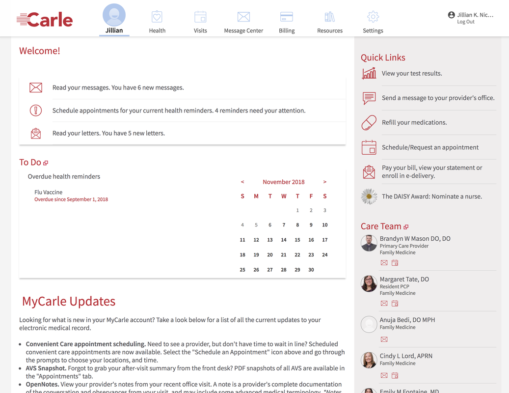
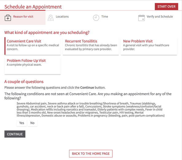
- MyCarle is overall cleaner and has more clearly defined hierarchy, and better use of design principles. You can see icons on the right and along the top that quickly point out categories. On the ELIS interface, each menu item on the right hand side just appears as a wall of text, not as clearly differentiated elements. The font sizes are smaller and harder to read. Although MyCarle does not have a table of information in the same way as ELIS, where it does have rows of information they are more clearly articulated, has more spacing between elements, elements are larger and more readable, and has little icons differentiating categories quickly.
- There is more spacing between elements, more whitespace overall. On ELIS, it feels cramped and not enough breathing room for all of the elements.
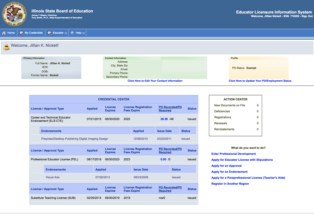
- Categories are more clearly organized. On ELIS, for example, there's a tab that says "Educator". There isn't a lot of indication of what it does right away. There is less confusion on MyCarle about what each tab does.
- Cons of MyCarle: There are still no easy "escape hatches" if you want to try and call an actual human being. There's no contact tab with a phone number of different departments. I guess the point of this site is to make online appointments, and it's actually pretty easy to make appointments with the appropriate department.
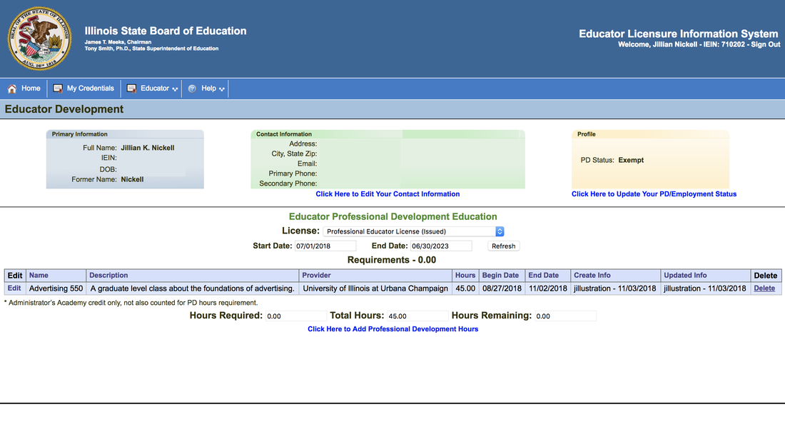
- I think the "action center" on ELIS could be designed more like "My Carle" where there's a chart along the top that shows alerts.
2. Can you see some design tradeoffs in the different choices that different designers have made?
- Truthfully, the ELIS site just seems a lot more dated and like they did no usability testing whatsoever. It's challenging to navigate and find the correct information on the landing page.
- MyCarle traded off some of the clutter and making the user click through to Letters and Messages where ELIS basically has an action center on the right. It also took away all the profile information that's located on the top of ELIS and whisked it away to "settings".
Making an appointment(MyCarle)/Adding Experience(ELIS):
1. How does the usability of this competitor compare to the application you are trying to fix?
What do they do better, what do they do worse?
What do they do better, what do they do worse?
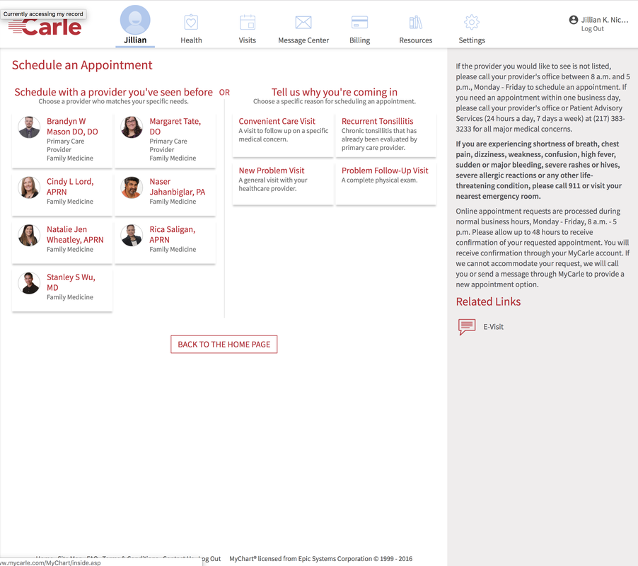
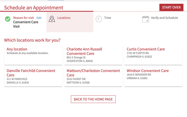
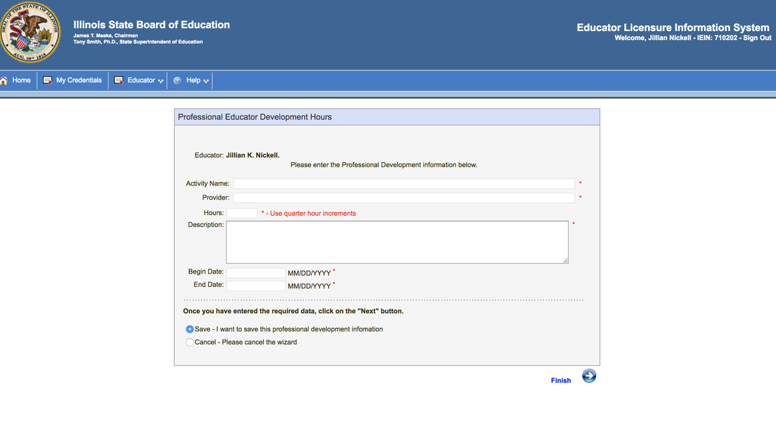
- While not 100% analagous, the landing page for managing appointments and the landing page for adding experience do have some commonalities. Again, the design on mycarle includes more whitespace/better hierarchy overall (carried over from the main site). I also feel that the boxes on MyCarle flow better and are easier to read than the table on ELIS. It's a lot clearer where to click to add experience/ add an appointment. Information is chunked more evenly together with a very clear hierarchy on MyCarle (schedule an appointment with a provider you've seen, or tell us why you're coming in). ELIS, it's all small fonts and it all mushes together, and it's not as clear immediately where to click for what you want.
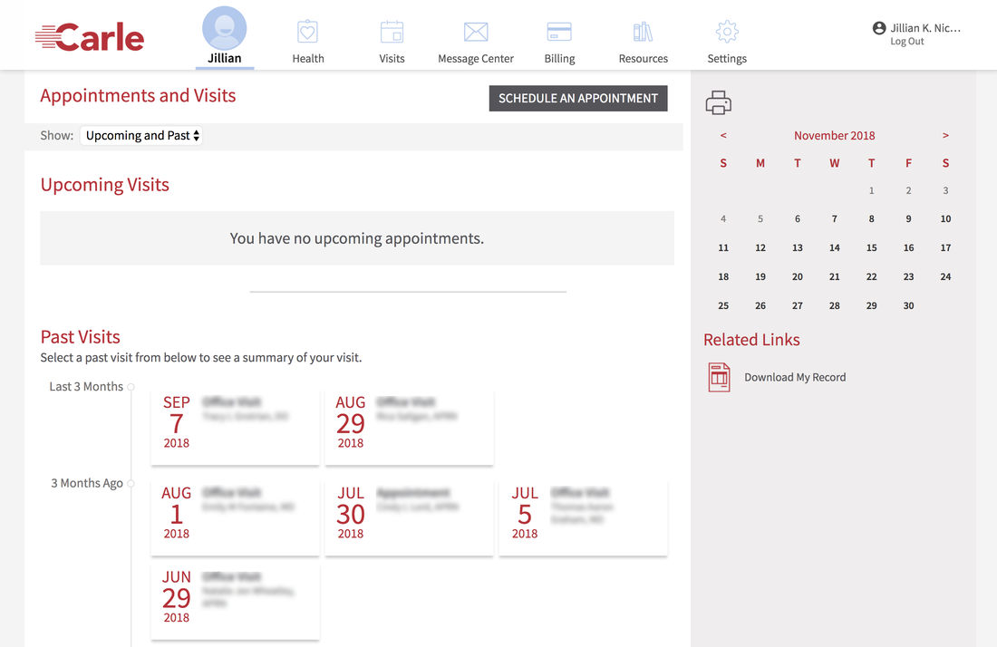
- I also liked the "timeline" showing past appointments under the appointment manager aspect of the site, and wonder if something similar could be designed for ELIS - where a more visual, infographic representation of the same information would make this a little easier to navigate. Also, this section of the site has a nice "Schedule an Appointment" button that stands right out and makes it easy for the user to navigate, unlike the ELIS site which has "Click here to add hours" in tiny, tiny font.
- MyCarle also has an easy "Escape Hatch" - back to home page - down at the bottom. This might be nice on ELIS.
- The calendar on the right was nice on MyCarle. It kept the design consistency - the righthand bar - the same across interfaces, something ELIS does not do. I do not know if you could have ELIS have something similar on the right.
- Probably on ELIS the user's profile doesn't need to be displayed on every page, there can probably be a separate page for that.
- MyCarle has a really nice flow while you're booking appointments - there are tabs across the top with clear icons that are highlighted when you're on them, such as "reason for visit", "locations" and time". Information related to each category is listed clearly in a grid structure below that makes scanning for information easy. In contrast, ELIS just has a box with tiny letters and boxes that you fill in. While functional, it's not as quickly and easily readable. ELIs also has a strange radio button thing going on - save/ cancel - and a separate button that says "finish".
- I really think the designers of ELIS probably didn't do usability testing and instead just made a site that was easy for developers to make and not for users to use. It smacks of a Microsoft Office excel sheet. It likely is an older interface, but even so almost no design or hierarchy was taken into consideration.
