Overview
These are the final proposed redesigns for the ELIS website. Because the site is so outdated, I would assume that it would need multiple rounds of revisions and tests before it's much more usable. Therefore, I decided to prioritize and choose the most urgent problems and tackle those first.
Choosing which problems to solve
You can read some of the original problems I discovered from cognitive walkthroughs and user testing here.
Before I did my final redesign, I decided to do a cost/difficulty analysis, with 1 being least important and easiest, 5 being most important and most expensive.
Before I did my final redesign, I decided to do a cost/difficulty analysis, with 1 being least important and easiest, 5 being most important and most expensive.
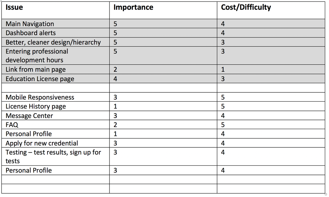
Because the entire site is outdated, it seems to me that completely overhauling it is needed, which therefore makes the cost of reworking most of the problems relatively high. Cost then became less of the defining factor, since they're all pretty "expensive". I tried instead to focus on the most urgent sections. To me, those sections are:
There is a LOT more I can't get to. Here are just a few things I decided NOT to tackle this time around and why:
- Link from home page – this is definitely not THE most important, but it’s an incredibly easy, and therefore cheap, fix, just removing a few steps and changing the login page, so I added it here.
- Main navigation – it’s currently so disorganized that users can’t find anything they need. Organizing categories will make it easier for users to find what they need.
- Dashboard – when users end up here, it’s hard to make heads or tails of the information presented. Additionally, if you consider that teachers only come here once or twice a year, this is the most important page and should contain alerts so they know if they need to attend to something right away.
- Better, cleaner design and better hierarchy – Coming up with a consistent look can be applied across pages, which will save time and money down the road. It will also make the site much more readable and therefore more usable.
- Education License page – this is literally what this app is used for, keeping teaching licenses updated.
- Enter professional development hours – again, this app is used to help keep your licenses current, and entering professional development is the most common way teachers can do that. By extension, I also decided to redesign the professional development history page, where you can see what professional development you've already entered and how far your progress is.
There is a LOT more I can't get to. Here are just a few things I decided NOT to tackle this time around and why:
- Mobile Responsiveness – I do think this is pretty important, but cannot really be looked at until some of the other issues are addressed first. Redesigning for desktop and then looking at formatting it for mobile makes the most sense. I think this would get overhauled in another round of redesign, after the other pages are overhauled.
- Apply for new credential – very important, but mainly, you have to contact your Regional Office of Education (ROE) to do it because they have to verify your paperwork. Probably I’d just set up a placeholder page explaining this with a link to call.
- Contact page – there’s a link for this on the main Illinois State Board of Education (ISBE) page to contact your ROE, I would just set this link to send you there. It can be overhauled at a later date, but they’ve got something that will function for now.
- FAQ – there’s a section of this on the ISBE main page, not on this app. I think a link to there could work for now, even though it really does need a complete overhaul to make it easier to search for questions. In addition, having a link to phone numbers for the regional office of education will allow users to call in the meantime if they’re confused.
- Personal Profile, Message Center, Testing – I think these pages are all important, just not as urgent as some of the other fixes. Also, I think once the other sections are designed, the design conventions can be applied to some of the subpages and you can throw something together based on the rest of the app even if it's not as usable yet. For example, you’d have a new navigation and design color schemes. I’d save a complete overhaul of these for round 2.
- License history page – this might be necessary sometimes for teachers to look up, like if they want to see where they worked before, but most teachers are coming here for current employment. Therefore it’s not as urgent as current licenses and is low on my priority list.
Main Navigation
Original site

The dropdown options under the "educator" tab
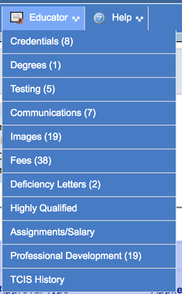
The categories as currently designed are a rat’s nest. There are links on the right, links in the main nav that are not organized well, and links in the table on the front page, that are not easily recognizable as links. In order to clean this up, I conducted a card sort, the results of which you can view here. This helped me simplify categories.
Card Sort Results/ New sitemap
To see the original cardsort, click here.
To see the original cardsort, click here.
- Dashboard
- Alert Center - needs immediate attention.
- Fees due – link to pay. You don't need to pay these all the time so likely this is the best place for it, it just shows up when you need it..
- License expiration date approaching
- Number of PD hours needed to keep a license current
- Tests required
- List of current licenses
- PD Hours earned/needed
- Endorsements
- Issue date
- Expiration date
- If no license (new teacher) alert says “apply for new”
- Alert Center - needs immediate attention.
- Professional Development
- Add PD hours
- View past PD
- Print paper forms
- Find PD providers –
- dashboard, maybe searchable database.
- FAQ – for now, link to external database. Later:
- What qualifies as PD?
- How much are certain activities worth?
- Licensed PD providers
- Licensing + Approval
- License Requirements –
- external link to FAQ?
- Or searchable database?
- Current Credentials
- Alerts to deficiencies/upcoming deadlines
- Teaching Licenses
- Where are they currently registered
- History of registration
- PD hours earned/needed
- Graph? Link to add more hours from here.
- Issue date
- Expiration Date
- Endorsements
- Where are they currently registered
- Paraprofessional (same as above)
- Apply for new credential (sign up box)
- New License
- You have to contact your ROE to get this started, link to ROE contact.
- Paraprofessional license
- License Endorsement
- Approval (with explanation of what approval IS)
- New License
- Register in a new region
- Testing
- Test results
- Take a required test
- Highly Qualified
- What’s my status (show some kind of chart here showing what you need?)
- What are the requirements?
- License Requirements –
- Messages
- Communications
- License Alerts + Deficiency letters
- Fees Due/Fees Paid letters
- Message History
- Communications
- FAQ + Contact
- Contact your ROE
- License FAQ (link to external)
- Profile
- Employment Status
- Salary + Assignments + history of work
- Degrees Earned
- Contact ROE to add a degree (action button)
- Personal Contact Information
A few things I added in the final sitemap that I didn't have in round 1 :
- An area for viewing professional development that you already have already entered/your history and progress of professional development.
- A link under professional development for paper forms.
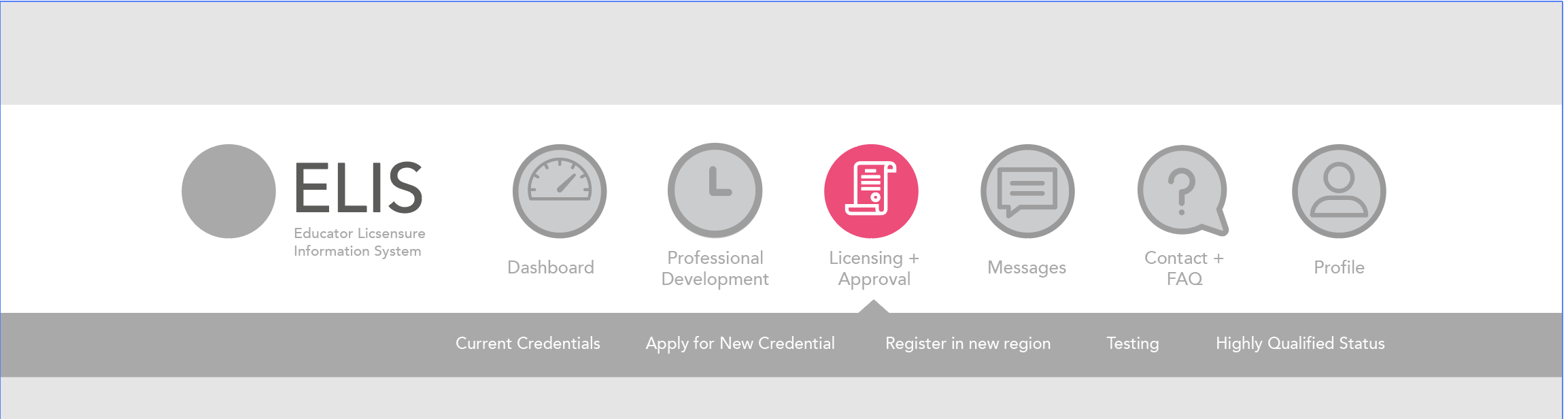
New site navigation design:

Improvments:
- Better organized categories. After the card sort, the navigation was consolidated into categories and sub categories sorted into each of these. There are only 6 categories now, and it's clear when it's "activated", with sub menu items showing up in the bar below when you click on that particular icon. In addition, it’s clearly highlighted with a different, contrasting/darker color when a category is hovered over, so that the user knows which is selected, which is much clearer than it was before, which should also help with vision accessibility issues.
- Breadcrumb trail. The user can see where in the system they are when they end up on a different page. This touches on the “visibility of system status” heuristic, which keeps the user informed of what’s going on.
- This navigation redesign also touches on something mentioned in “Don’t Make Me Think”. On page 70, Krug notes that “persistent navigation can accommodate only four or five utilities – the ones that users are likely to need most often”.
- Clearly designed icons. It’s clearly visible to not only tell what page you’re on but also easy to get to another page/back to the dashboard when you need to. I also left a space for a homepage/logo so users can click this easily to end up back on the dashboard. This goes back to the “user control and freedom” Nielsen heuristic, making emergency exits clearly marked.
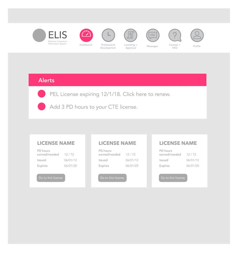
Dashboard
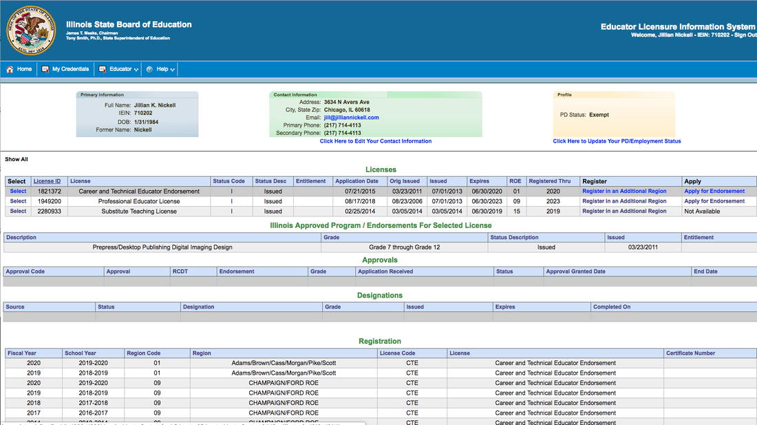
Original Site
As designed... this dashboard is a mess. There isn't enough whitespace, the design is not orderly or hierarchical at all, and there is not really consideration for why teachers come here. Licenses are listed, but they're difficult to read. The dashboard, as I said, should probably have urgent calls to action and reminders to do things. There is an "action center" but it's difficult to read and off to the right hand side. Contact information should be under the personal profile and not here, and the navigation overall should be cleaned up and better organized, and easier to see.
Redesign - Paper Prototype/ Round 1
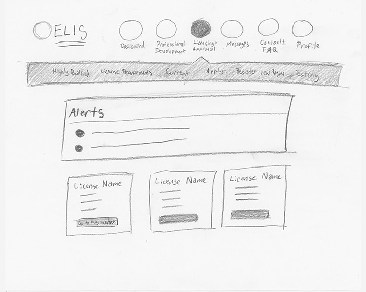
Above is my paper prototype for this site. I actually stayed pretty close to this design, only a few minor edits.
Redesign - round 2
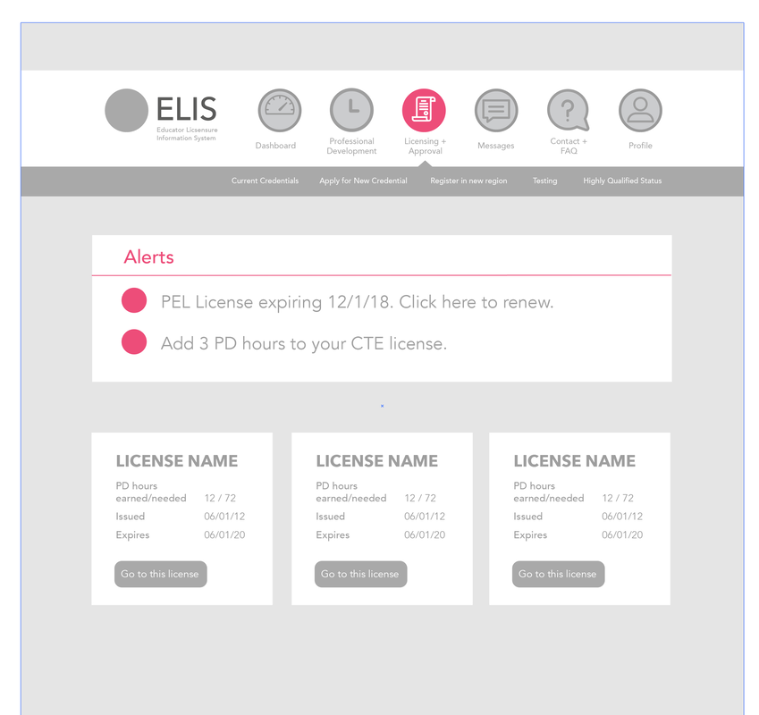
This is pretty close to the final; the only thing that I changed was that I made the header for the alerts section magenta so it pops out even more (see below).
Redesign - final
Improvements:
- Alerts for deficiencies, fees, deadlines, etc., have been placed front and center of the dashboard section, so that teachers know about it as soon as they log in. Since most teachers visit this site only a few times a year, alerts are the most relevant information for them and they are now clearly visible here.
- Below the dashboard, all licenses the teacher currently has will appear in a grid form, along with a "call to action" to go the that particular license. Not all of the information for every license is here, because it doesn’t need to be. It’s more of a quick overview for the occasional visitor. A more expanded view is available on the License page. This gets back to "Don't Make Me Think", which states on page 46 that "(it makes this) choice seem much easier by not confronting you with all the details at once".
- Overall, the design is cleaner and simplified, with elements moved further apart (making use of negative space) so that they are clearly differentiated. Call to action buttons are easy to distinguish instead of being lost in a table somewhere. Again, the higher contrast and larger font sizes will assist accessibility for users with low vision. This is also an example of Nielsen's "aesthetic and minimalist design". I also made the decision to add a brighter magenta color with a darker hue so that users notice things I want them to notice right away, from "alerts", to the icons highlighted in the main nav. It makes users notice relevant information more quickly. This color could be changed based on branding done at a later date, but should still be bright and darker contrast in terms of shade from the other colors on the site for color blind users, thinking again about accessibility. I also made the decision to have the drop down be a darker shade so it contrasts nicely and is readable.
- Nielsen's "Error Prevention" and "Recognition Rather Than Recall" are also used here. Because the navigation has been cleaned up and information has been properly categorized, not everything is on the home page now. Users aren't bombarded with everything right when they get here. The careful design is intended to keep errors from preventing in the first place.
License Page
Original Site
The license currently is a mess in the same way that the dashboard is. It's unreadable and has very little hierarchy. Pulling out information is impossible.
Redesign - round 1
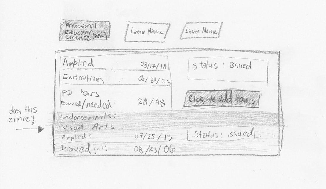
My original "tabbed" license design. While the tabs along the top allow licenses to be more separate, this original rough is too jumbled and all the information isn't clearly differentiated from each other. I had the "add hours" button in there but it's not clearly associated with professional development hours, so it's kind of unclear what it is. Overall, this is an improvement but still a jumbled mess in the license information area.
I also didn't know whether or not endorsements expired, or how to categorize those. That came a bit later in the design, as this was just a rough.
I also didn't know whether or not endorsements expired, or how to categorize those. That came a bit later in the design, as this was just a rough.
Redesign: Round 2
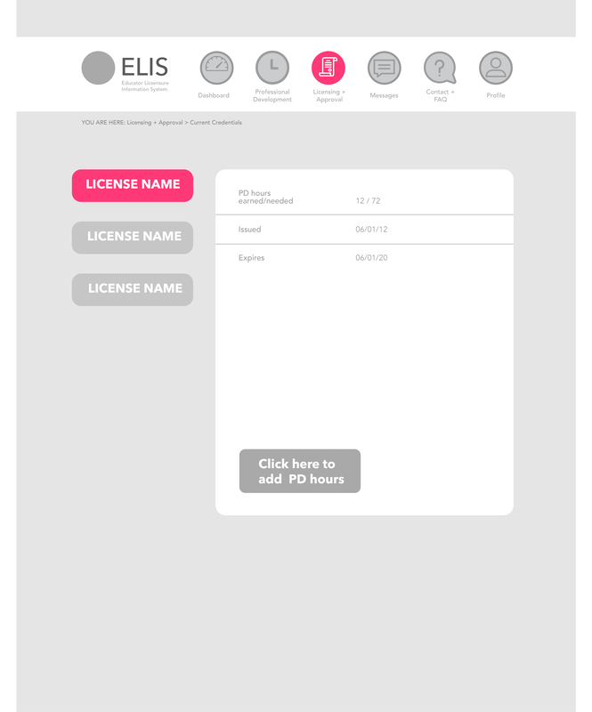
I did try the "tabbed" license idea with the tabs on the lefthand side. However, I did not feel that this stayed close to platform conventions (Nielsen's "consistency of standards), since on most platforms users are used to seeing important information along the top. I also felt that this squeezed the table on the right too much, and made it more difficult to add any "calls to action" or any other relevant information. Also, professional development hours is again off by itself and not linked with the professional development row.
Redesign Round 3
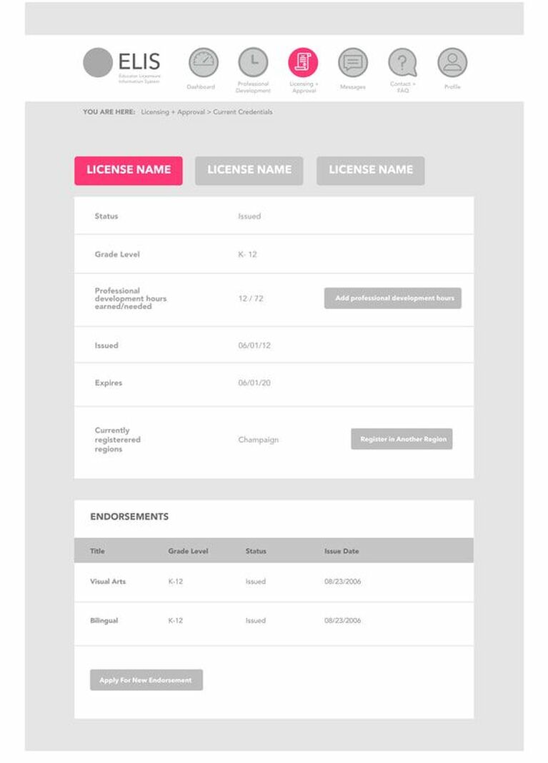
This is much closer and getting more readable; but I felt that the "endorsements" section felt a little... off? The hierarchy wasn't sitting well with me here, Endorsements didn't feel like the most important thing in this table, so I played with it a bit more.
Final Redesign
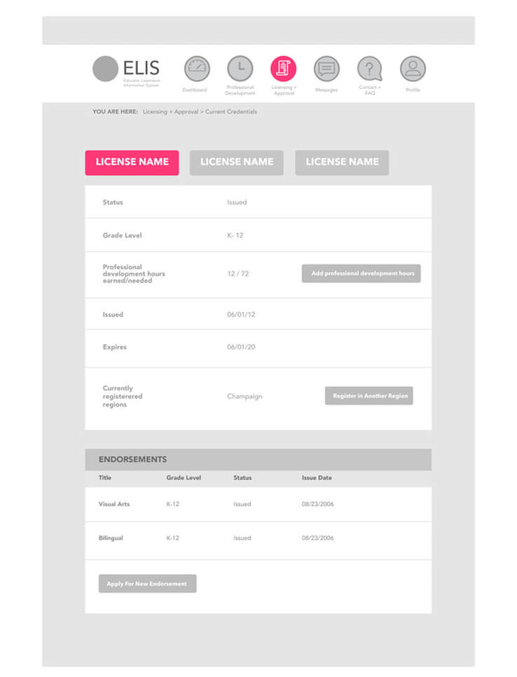
In the final design, I went back to the top aligned tabs. I also figured out how to re-organize the information so that it's less of a jumbled mess than it was in the paper prototype. I changed "PD hours" to "professional development hours". While most teachers will know what this is, it makes it less confusing when the full name is used. I also made sure to put the "professional development" call to action button in the same row as "professional development hours earned/needed". I also made sure to make the header of the Endorsements box stand out a little more.
Improvements:
Improvements:
- Tabbed licenses. The current license is “highlighted” using a brighter color. It’s easier to tell right away which license you are on. There is also a better sense of overall hierarchy, with the license name being the most important information. That way, all the information for every license isn't all showing all at once.
- Table redesign: Information is listed with smaller font sizes and is given more white space all around so that it is easier to read, not crammed into tiny rows. Also, this will improve accessibility for readers with low vision. I also made call to action buttons (like register in another region, or add professional development hours) in this table bigger and more readable (they were nearly impossible to see on the original table, as they were just text links).
I did not add a link in this table to view past professional development hours; there is a link for that under "professional development" in the main nav and it seems like it would take up too much space and make it cluttered and confusing to put it here.
This design touches on Nielsens Hueristics of aesthetic and minimalist design and increasing flexibility and efficiency of use. It also touches on a concept mentioned in “Don’t Make Me Think” on page 46 – making choices easier by not confronting you with all the details all at once. - Endorsements are grouped together at the bottom. I actually had to call the regional office of education for this one. I was not sure if they expired separately from the main license, or if you had to do special professional development in order to maintain them (it was unclear from the original site). It turns out, you do not. Once you have an endorsement, it just become a part of that license until the license expires. So it seemed that the only button I should add here is the “apply for another endorsement”. This harkens back to Nielsen’s “Recognition rather than Recall” because it makes the only real options (add another endorsement) visible.
Earned Professional Development page
Original Site
This area has basically the same problems as the rest of the site since it's based on the same design. Unnecessary information "upstairs" - the personal profile that should be moved elsewhere-, the call to action buttons that are impossible to find, no whitespace or hierarchy, etc. It's hard to actually see how many professional development (PD) hours you've earned vs how much you have to go, and it's hard to read the information in the rows on what you've already entered. Also, there is a "start date" and an "end date" area up above. Because professional development periodically expires, it makes more sense to me to have the default be set to show current PD and maybe just have a call to action button to see expired PD instead of a confusing date range entry here.
Redesign - round 1
I did a rough sketch here to think things out. I stuck with the tabbed design upstairs, and figured some kind of visualization might be necessary of your progress (the progress bar). I hadn't completely thought out all of the categories for the table just yet, hence my doodle with the categories on the right. I did also think it was a good idea to add "see past professional development" instead of having a date range, since it's not relevant to keeping your license current. It's cool to see, but you don't need to see that here.
Redesign: Round 2
I kept the tabbed license design from the licenses page, so you can switch between licenses. I hadn't figured out the edit/delete buttons just yet in this version. I liked the progress bar better down below, but I felt it probably needed its own "table" just like the one right above it, so that it is more organized. I also added buttons for "add professional development" and "see expired professional development" in the respective tables. The add pd button is perhaps a bit repetitive, but it's the most common thing teachers do here, so it needs to be easy to find.
Final Redesign
I made a separate section for the progress bar, and added edit/ delete icons. I'd have a warning pop up before actually deleting a row. The edit button takes you to the form where you add professional development.
Improvements:
Improvements:
- Improved design/hierarchy (Nielsen's Aesthetic and Minimalist design)
- Got rid of the date range and just have a "see expired professional development" call to action button, so you can see past activities if you want.
- Cleaned up some of the categories and made them more relevant. You don't need to see EVERYTHING here, you can go to the edit page for that. Writing out a whole description and having it show up here is not necessary. It might make sense in future versions to have a "see documentation" button, but that would just take you to the same place as the edit button, so that seemed a bit redundant.
- Progress bar. I find it easier to see how much I need to earn if it's visualized in a graph or chart, and I think this will help users understand how much further they might need to go (Nielsen's visibility of system status).
Enter Professional Development page
Original Site
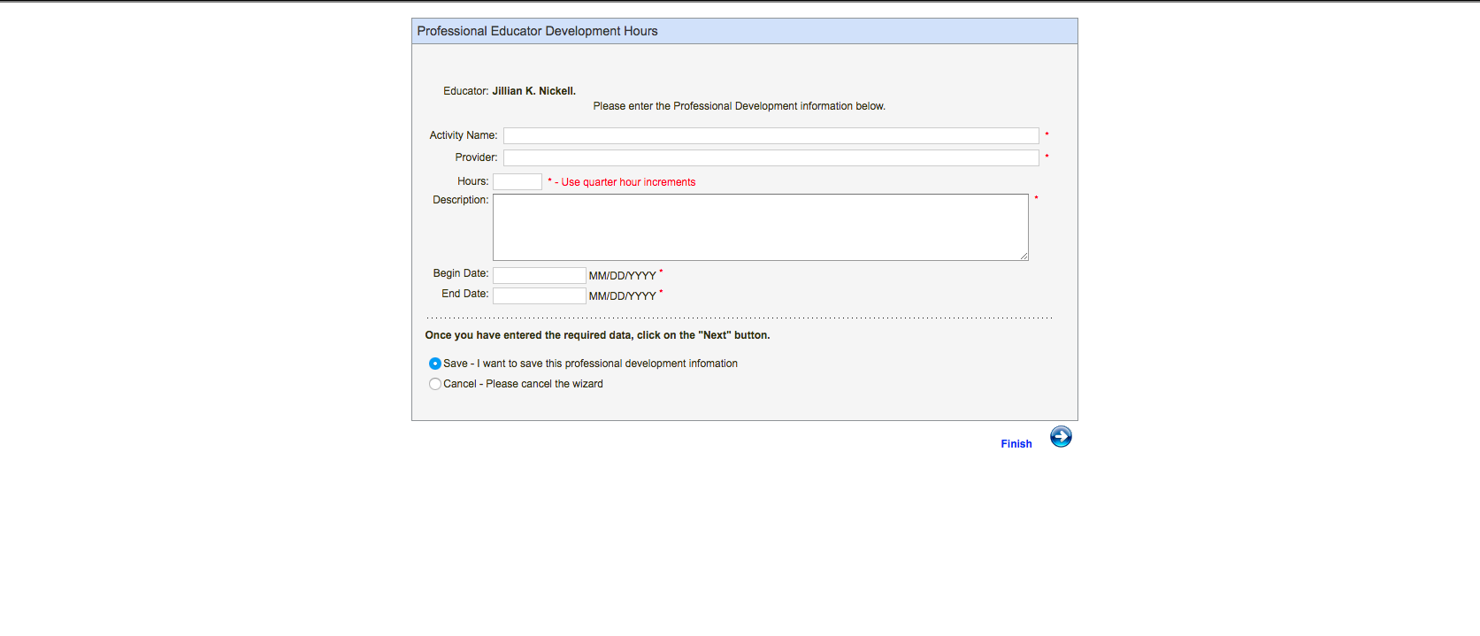
While not horrible, this page has kind of a bad date picker, there are better designs out there. Also, there are only so many approved providers that you can use, but this form lets you type in whatever you want in this field. I think it would be better to have a dropdown list where you can choose from the list, thus eliminating a lot of confusion for teachers. (Nielsen's "error prevention" and "recognition rather than recall" standards).
Also, as a teacher you're required to keep documentation of having attended these programs. The state sometimes audits teachers to make sure they're current on their professional development. Which means you have to keep a paper folder full of hard copies somewhere, with forms that have been filled out and signed by approved providers. I think it would make more sense to have a place on the online form to upload a scan of this signed paper document. I'm not adding a link to that pdf printout on this page; instead it's listed as one of the drop down options under "professional development". The link would say "paper documents" and take you to a place to download it with an explanation of what it is.
There is also a paper form teachers must fill out documenting why the conference they attended was useful, which differs from the electronic form, that teachers are required to keep and fill out, and it's not linked from this page. You can see it below.
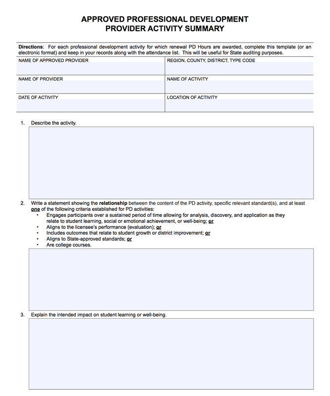
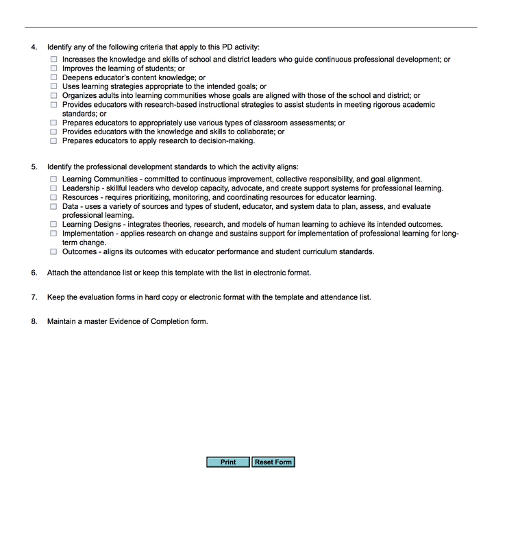
In order to make a teacher's life easier, I think merging this paper document with the online one will makes more sense. It's one less piece of paper to print out and keep track of if they only fill out all the information here.
Final redesign
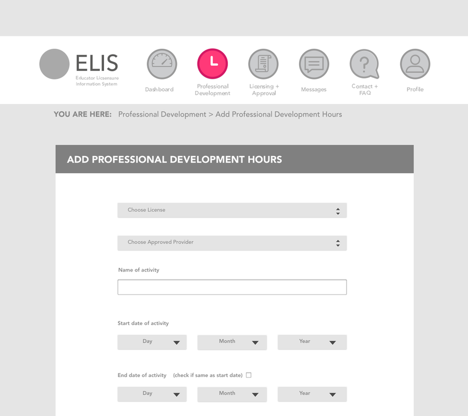
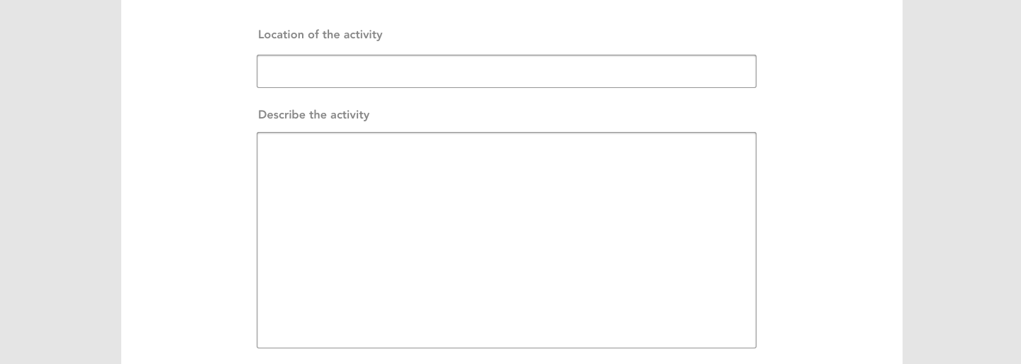
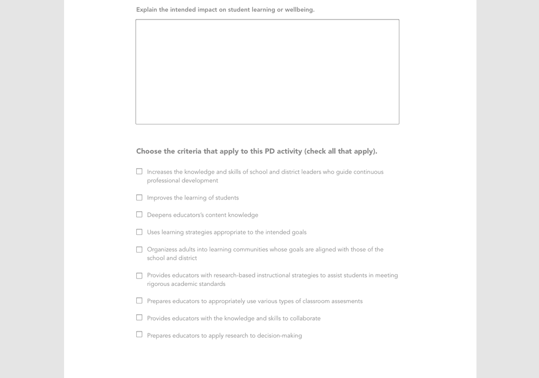
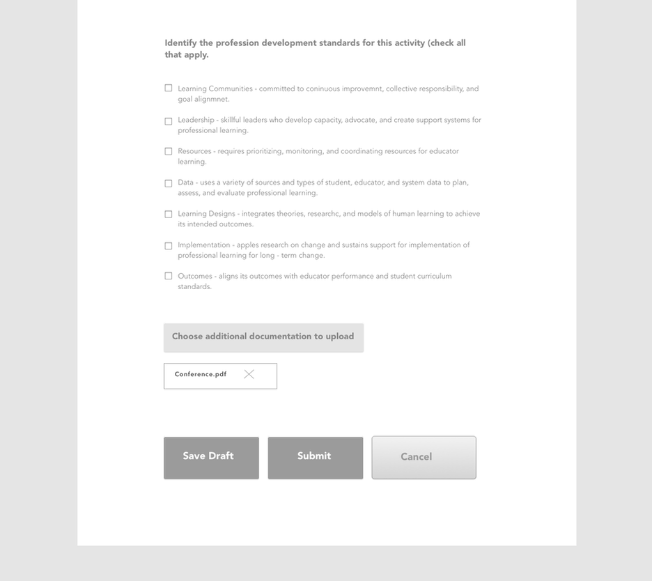
Note - I broke this form into sections because Weebly compresses larger images and pixelates them when you upload them. It's really just one long form.
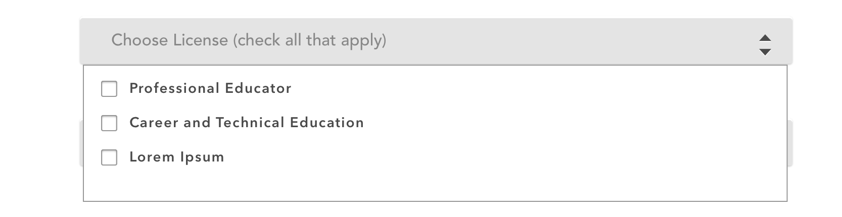
I didn't do a paper prototype of this design and relied a lot on design conventions I established on other areas of the site, so there weren't as many iterations of this section. The only thing I thought of later was that "choose license" should have a "check all that apply" option, because most professional development can be applied to more than one license.
I didn't do a paper prototype of this design and relied a lot on design conventions I established on other areas of the site, so there weren't as many iterations of this section. The only thing I thought of later was that "choose license" should have a "check all that apply" option, because most professional development can be applied to more than one license.
Improvements:
- More whitespace, easier to read larger font (Nielsen's minimalist and aesthetic design).
- Better date picker, allows you to choose a date from a drop down. You can also check if it the end date is the same as the start date, saving the user some time (Nielsen's flexibility and efficiency of use)
- Drop down lets you choose a license, and there is also a drop down for approved providers, eliminating confusion.
- Got rid of the weird multi - level radio buttons on the bottom and just switched it to clear buttons that say "Save draft", "submit" or "cancel".
- Merged the questions paper printout documentation with this form, eliminating a step.
- Made it possible for teachers to upload signed additional documentation here instead of having to hang on to those in a folder that they might lose.
Conclusion
This is a huge project because the app is so old and clunky, and I was not even close to being able to touch everything. Even with my redesign I am still thinking of things I could fix. I'd definitely want to do a paper prototype test with users again even with this version before I sent it off to a software team.
Also, because this is a class project and I'm not working with the actual team on the board of education, there are a lot of laws and regulations that may not be touched upon here, and I'd assume if this was a real project I'd find out legal requirements first before doing any of the redesign.
Also, because this is a class project and I'm not working with the actual team on the board of education, there are a lot of laws and regulations that may not be touched upon here, and I'd assume if this was a real project I'd find out legal requirements first before doing any of the redesign.
